1900's Home
First floor renovation
This older home had great bones, but it just needed some updating. We opened up the wall between the old dining room and kitchen to allow for a big island and we reconfigured the kitchen so the parents can now see the kids playing in the back yard through a new triple window. We also did a four panel door that lets the natural light just pour in and also makes the outdoor and indoor spaces feel like one!
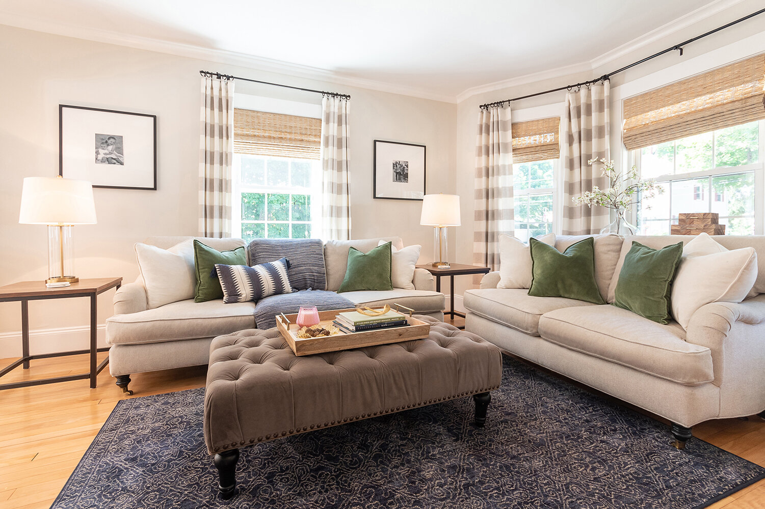
The direction was light & bright, with warm brass tones and pops of hunter green and navy. Creamy white walls and white cabinets make the space feel large and open. Light wood tones and woven shades make the space feel inviting.
The dining room table is one of my favorite pieces in this project. It is a commercial grade faux leather table, which means it’s kid friendly, but is still a show stopper! Instead of a traditional backsplash we carried the quartz up the wall for some added drama and richness!
In the family room the stripe curtains layered with woven shades add some personality to this space. The focal piece in this room is the creamy white and brass beaded light on the ceiling. It is unexpected, a little whimsical yet sophisticated!
Finally, in the powder room we went with a classic pedestal sink true to a 1900’s home and did a boxed out window that feels like it was always there. We chose a gorgeous gray wallpaper and a wooden beaded light for some added charm.


